IndyFurCon 2026 Conbook Design System / Preview Site
v1.0
Project Status
⚠All recommendations and suggestions presented in this guide will be considered, but final design decisions are made by marketing. Adjustments to community preferences are typically only made for two reasons: (a) they conflict with established rules of good design by industry standards, or (b) the volume of content required to fit within the available space demands a more practical solution.
Design System IFC 2026
This guide documents the typographic and color decisions for IndyFurCon 2026 printed materials. Before locking in any choice, the considerations below should inform every decision — what looks great on screen often behaves very differently on paper.
ⓘPlease note any examples of pages, titles, or events are purely fictitious and used here only to provide visual context.
Typography in Print
Print resolution is fixed at the moment the file goes to press. Unlike a screen where type is rendered dynamically, a printed page cannot compensate for a poor font choice at a small size. Every typeface decision should be evaluated at its intended print size, not at screen zoom.
⚠Decorative fonts at small sizes. Display and themed fonts are designed to be read large. Below 14pt they often lose legibility — fine strokes disappear, ornate details fill in, and spacing collapses. Reserve them for headings and titles only.
Condensed fonts are a practical choice for event programs and schedules — they pack more information into a tight column while remaining readable. However, condensed faces can feel cramped if set too small or with insufficient leading. Test at the actual print size before committing.
Weight contrast matters. A bold heading above a regular-weight body creates clear hierarchy on paper. If the weight difference is too subtle, the hierarchy disappears when printed, especially on uncoated stock where ink spreads slightly into the paper fibers.
ⓘLimit typeface count. Two typefaces — one for headings, one for body — is almost always sufficient. A third may be used sparingly for decorative or accent purposes. More than three creates visual noise that undermines the printed piece.
Color in Print
Colors defined on screen in RGB must be converted to CMYK for print. This conversion is not 1-to-1 — highly saturated RGB colors, particularly bright blues, greens, and oranges, often shift noticeably when printed. All palette colors on this page are defined with their screen approximation; the authoritative CMYK values in the Affinity palette file govern the actual print output.
⚠What you see is not what you get. Never approve a color for print based solely on how it looks on a monitor. Request a physical proof or at minimum a calibrated soft proof before sign-off.
Ink coverage affects both cost and quality. Solid fills of very dark colors (especially near-blacks built from four CMYK inks) can cause registration issues, slow drying, and bleed-through on lighter stock. Rich blacks should be used intentionally, not as a default.
Contrast on paper is non-negotiable for readability. Light text on a mid-tone background that looks fine on screen can become unreadable when the ink density shifts slightly in the press run. Use the Accessibility section of this guide to evaluate each color pairing before applying it to body content.
✓Paper stock changes everything. Coated stock (glossy or matte) holds ink more precisely and produces more vivid color. Uncoated stock absorbs ink, causing colors to appear slightly darker and less saturated. If the final print spec is unknown, make conservative color choices that hold up on both.
Font Choices
Headings
Font options for headings are not very limited. The more coverage a font, font-family or superfamily has, the
more likely it is to be useful for headings. However, many fonts are designed for specific purposes and may not
be suitable for headings.
The fonts to choose from for headings have been provided by team members and are all available free or at
a minimal cost.
Heading fonts traditions display in print at 36pt, 24pt and 18pt which will vary as layout changes demand.
All the fonts here seem to fit for the theme though as explained in the typography section above, many of these
fonts aren't useful for anything smaller than about 14-16 point because they are "artistic" single-use fonts
and not designed well for smaller sizing.
Display & Decorative
Disco PartyDisco Party.ttf
IFC 2026
IndyFurCon 2026
Groovy DayGroovyDay.woff / .ttf
IFC 2026
IndyFurCon 2026
Magic NightMagic Night.ttf
IFC 2026
IndyFurCon 2026
MoonlightMoonlight.ttf
IFC 2026
IndyFurCon 2026
Retro & Themed
KC Close Encounter — BoldKCCLOSEENCOUNTER-BOLD.OTF
IFC 2026
IndyFurCon 2026
KC Close Encounter — InkedKCCLOSEENCOUNTER-INKED.OTF
IFC 2026
IndyFurCon 2026
KCRagsakKCRagsak.otf
IFC 2026
IndyFurCon 2026
MexcellentMexcellent Rg.otf
IFC 2026
IndyFurCon 2026
Mexcellent 3DMexcellent 3d.otf
IFC 2026
IndyFurCon 2026
DiscoDiva — Style Variants
DiscoDiva — BaseDiscoDiva-Base.ttf
IFC 2026
IndyFurCon 2026
DiscoDiva — InlineDiscoDiva-Inline.ttf
IFC 2026
IndyFurCon 2026
DiscoDiva — LineDiscoDiva-Line.ttf
IFC 2026
IndyFurCon 2026
DiscoDiva — OutlineDiscoDiva-Outline.ttf
IFC 2026
IndyFurCon 2026
DiscoDiva — SketchDiscoDiva-Sketch.ttf
IFC 2026
IndyFurCon 2026
Body
Body fonts have different constraints from headers in that there is so much information in a conbook we need
to save and make space for everything but not at the expense of readability. There is no denying we have to
use a very small font to fit into layout, cost and printing constraints.
Acumin Pro CondensedAcumin Pro Condensed.woff / .ttf
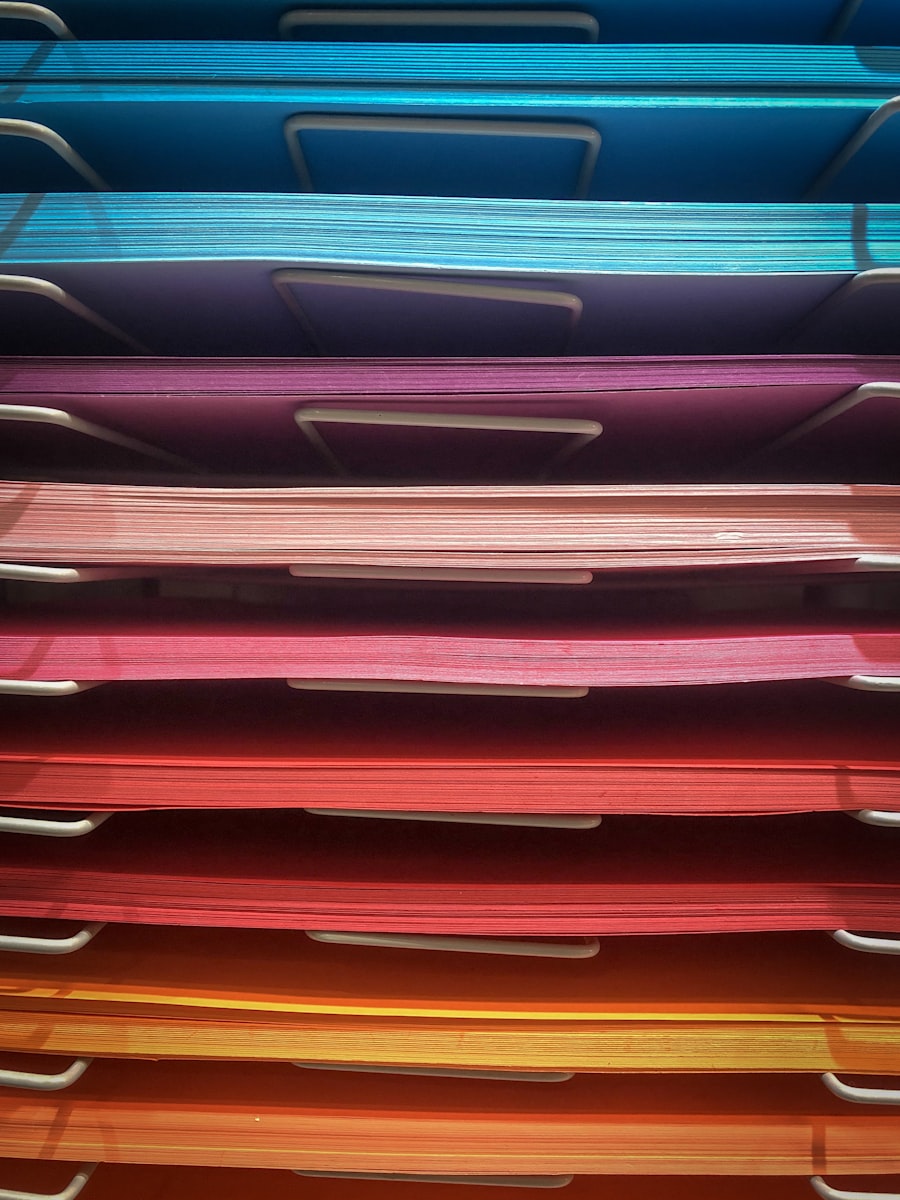
Select colors from the palette for the final theme. Use the Color Overview in the Color section to document intended uses once decisions are made.
#00BCD4
Name
Cyan
#3D4EA0
Name
Indigo Blue
#6B45A8
Name
Purple
#A84E85
Name
Mauve
#E5007D
Name
Magenta
#F47820
Name
Orange
#CC3320
Name
Red Orange
#1C2C5A
Name
Dark Navy
#0A0E1E
Name
Midnight
#6E2535
Name
Burgundy
#E87820
Name
Amber
#EDE272
Name
Pale Yellow
#FFE600
Name
Yellow
Section Heading
A good header font should be sized relative to the page size, be very clear at a larger font size but also
have some flexibility. Since most won't look good at lower font sizes, we keep heading at 36pt.
Mexcellent 3D36pt
Presentations
Section Sub-heading
Sub-heading is sort of misleading. The biggest use of the "concept" is for special introductions to sub-sections
of content for a given area or for page continuation within a section. We keep this between 14 & 24pt. Note that
1/2 interest fonts might be used to support continuation indicators if we don't rely solely on footer section
indicators.
Mexcellent 3D24pt / 12pt
PresentationsContinued
Paragraph Heading
Paragraph headings are used for sub-sections of explanatory body content, or as the titling of individual events, presentations, panels, and similar scheduled items within a section.
Acumin Pro Condensed12pt Bold
Paragraph Heading
Roboto Condensed12pt Bold
Paragraph Heading
Body Text
Acumin Pro CondensedBody range
Welcome12pt Bold
Welcome12pt Regular
Welcome10pt Regular
Welcome9pt Regular
Roboto CondensedBody range
Welcome12pt Bold
Welcome12pt Regular
Welcome10pt Regular
Welcome9pt Regular
Event Structure
Each event block consists of a title, day and time, host credits, and one or two body paragraphs. A 3pt gap separates the host line from the body, and paragraphs from each other.
Acumin Pro Condensed12pt / 9pt
Opening Ceremonies
Friday, 7:00 PM
Host: Jane Smith, John Doe
Join us for the official opening of IndyFurCon 2026. This year's ceremony will feature introductions from our guests of honor, a look at the weekend schedule, and the unveiling of the charity auction.
All attendees are welcome. Seating is first-come, first-served. Doors open 15 minutes before the event begins.
Roboto Condensed12pt / 9pt
Opening Ceremonies
Friday, 7:00 PM
Host: Jane Smith, John Doe
Join us for the official opening of IndyFurCon 2026. This year's ceremony will feature introductions from our guests of honor, a look at the weekend schedule, and the unveiling of the charity auction.
All attendees are welcome. Seating is first-come, first-served. Doors open 15 minutes before the event begins.
Acumin Pro Condensed + Roboto Condensed12pt / 9pt
Opening Ceremonies
Friday, 7:00 PM
Host: Jane Smith, John Doe
Join us for the official opening of IndyFurCon 2026. This year's ceremony will feature introductions from our guests of honor, a look at the weekend schedule, and the unveiling of the charity auction.
All attendees are welcome. Seating is first-come, first-served. Doors open 15 minutes before the event begins.
Remember, until we have all the data for large sections of the conbook set, it is difficult to say if the
spacing you see above, between lines, between paragraphs, will be in the final result. There are certainly
times when changing a couple pages of paragraphs to decrease the space between them by event 1pt can add up
enough to make room for something unexpected during development.
Color Overview
Primary palette colors with name and intended use. This is the reference record — update the Use field as assignments are finalized.
#00BCD4
Name
Cyan
Use
IFC Partners
#3D4EA0
Name
Indigo Blue
Use
Music & Dance
#6B45A8
Name
Purple
Use
Meet & Greet
#A84E85
Name
Mauve
Use
Performance
#E5007D
Name
Magenta
Use
Writing
#F47820
Name
Orange
Use
Arts & Crafts
#CC3320
Name
Red Orange
Use
Presentation
#1C2C5A
Name
Dark Navy
Use
Gaming
#0A0E1E
Name
Midnight
Use
— TBD —
#6E2535
Name
Burgundy
Use
Convention Services
#E87820
Name
Amber
Use
Fursuiting
#EDE272
Name
Pale Yellow
Use
Entertainment
#FFE600
Name
Yellow
Use
Social
Accessibility
Each palette color shown in three contrast contexts: white text on the color, black text on the color, and the color as text on black.
White on Color
Black on Color
Color on Black
TEXTCyan
TEXTCyan
TEXTCyan
TEXTIndigo Blue
TEXTIndigo Blue
TEXTIndigo Blue
TEXTPurple
TEXTPurple
TEXTPurple
TEXTMauve
TEXTMauve
TEXTMauve
TEXTMagenta
TEXTMagenta
TEXTMagenta
TEXTOrange
TEXTOrange
TEXTOrange
TEXTRed Orange
TEXTRed Orange
TEXTRed Orange
TEXTDark Navy
TEXTDark Navy
TEXTDark Navy
TEXTMidnight
TEXTMidnight
TEXTMidnight
TEXTBurgundy
TEXTBurgundy
TEXTBurgundy
TEXTAmber
TEXTAmber
TEXTAmber
TEXTPale Yellow
TEXTPale Yellow
TEXTPale Yellow
TEXTYellow
TEXTYellow
TEXTYellow
Design Constraints
Pagination & Imposition
Saddle stitching requires page counts in multiples of 4 — 45 pages will need to be adjusted (typically 44 or 48 pages).
"2-up" means printer spreads (two pages per side), so reader spreads differ from printer spreads — design as single pages unless doing custom imposition.
Be aware of page creep (shingling): inner pages shift outward and get trimmed more.
Margins, Bleeds & Safe Areas
Standard bleed: 0.125" (1/8") on all sides.
Keep critical content inside a safe margin (~0.25"–0.375") from trim.
For saddle stitch, inner margins (gutter) should be slightly larger to account for creep and binding.
Avoid placing text or images too close to the fold — especially across spreads.
Creep / Shingling
The thicker the booklet, the more inner pages extend outward.
This results in progressive trimming of inner pages, which can:
Cut into margins
Misalign cross-spread graphics
Printers often compensate, but designs should avoid tight alignment across spreads.
Color & Ink Coverage (CMYK)
Use CMYK only (no RGB or spot colors unless specified).
Keep total ink coverage (TAC) typically under 280–300% depending on paper.
Large solid dark areas may show:
Banding
Drying issues
Rich blacks should be built (e.g., C60 M40 Y40 K100) instead of 100% K alone.
Images & Graphics
Resolution: 300 DPI at final size.
Avoid scaling raster images beyond ~120%.
Use vector graphics where possible for sharpness.
Heavy use of graphic underlays can cause:
Muddy appearance if opacity stacking isn't controlled
Registration issues if not properly flattened
Paper & Bulk Considerations
8.5" × 11" folded = 5.5" × 8.5" finished size.
Paper weight affects:
Creep severity
Opacity (show-through) — important with heavy graphics
Coated vs. uncoated stock impacts color vibrancy and drying.
Binding Constraints (Saddle Stitch)
Spine cannot hold text — no printable spine.
Booklets don't lay perfectly flat, especially with heavier stock.
Cross-spread images will be slightly interrupted by the fold.
Avoid overly small type (generally ≥ 8–9 pt for body text)
Watch contrast when placing text over graphic underlays
File Setup & Prepress
Provide print-ready PDFs:
Single pages, not spreads (unless printer asks otherwise)
Include bleed and crop marks
Embed fonts and outline if required
Flatten transparencies if printer workflow requires it.
Alignment Across Spreads
Avoid critical elements spanning across the gutter.
If necessary, expect slight misalignment due to folding and trimming tolerances.
Layout
Page Background
In 2025 we used a "parchment" like paper stock background on everything except for the front/back
pages which were full art. This was a thematic choice that worked well so long as we maintained the
ability to keep the background image visible but not allow it to bleed into other text and images.
For this year, I'm not sure that a full image background is going to work well because 2025's core color
palette was more subdued while this year is shaping up to be very vibrant and associated images express
that same sentiment. Of course, colors may shift up or down in intensity in order to work with other images
and text, most of the colors are strong enough they may not all be well suited as background colors and
the theme in general is bright which makes accessibility a concern. but I'm convinced a color background is
going to be a more functional choice this year.
Each sample below represents a different background color. Most are based off the existing theme colors and
some are pretty subtle. This is just meant as a quick look at some options to get everyone thinking a possible
customization. I have also been considering using a changing color background across the conbook based on
section since whe have colors defined by section already rather than using just one color through the whole
handbook.
Sections
Defining Sections
The sections below are my way of tracking all the various deliverable sections for the conbook. There
are two kinds: primary sections and secondary sections.
Primary sections are the main divisions of the conbook. They provide a clear structure and organization for
different areas of content. In the table below you can find my coded list and brief description of each
primary section. Keep in mind, this list is likely change right up until development starts on the conbook
and that primary vs. secondary in no way means required vs. optional, first or second, or where something
might be placed or the attention each needs.
You see each section has a code name and a description. One of the reasons I use this is because not only
does it give me an at-a-glance view of the contents, it can help with order, placement, help identify things
that might be needed which are missing or what can be removed for this years book that might have been include
before and is just not needed.
Most important to these, and to me, is the third column you see. For every page in the code book, the layout
offers four "panels". How they layout is entirely up to the design and implementation...initially, these help
pre-define an amount of space consumed for each section and thus a way to roughly calculate how many pages will
be needed for printing. This can help with strategy, managing expectations and estimating costs. As the project
progressing I'll add more data to include actual panel calculations once I start getting content. All this information
is stored in a comprehensive database that helps me manage my workflow and provide time estimates as needed.
Primary Sections
In Progress Active work underway on this section.
QA Content is complete and under review before final approval.
In Talks Marketing / Theming may need to discuss this page or its components for use and quality.
DONE Complete and approved.
No pill — Not yet started.
Approved for Book — This section has been agreed upon and will most likely appear in the conbook.
No checkmark does not mean a section won't appear — it may still be included pending available space.
Secondary Sections
Pages that appear in the conbook but do not belong to a named section — covers, ads, one-off inserts, and similar standalone items.
In Progress Active work underway on this section.
QA Content is complete and under review before final approval.
In Talks Marketing / Theming may need to discuss this page or its components for use and quality.
DONE Complete and approved.
No pill — Not yet started.
Approved for Book — This section has been agreed upon and will most likely appear in the conbook.
No checkmark does not mean a section won't appear — it may still be included pending available space.
Calculations
Based on the total panels estimated across all primary and secondary sections, the conbook is currently estimated at 49.75 pages. Saddle stitching requires a multiple of 4, so this will need to round to either 48 or 52 pages before going to press.
Local Area Business Brochure / Pamphlet
Overview
The brochure (or pamplet) is a promotional handout for IndyFurCon 2026 (have yet to decide on version). It could take a few forms: a two-sided letterhead letter, a one-page 2026-themed flyer, or the current leading format — a 2-up, single-fold layout on 8.5×11 that produces a compact four-panel piece when folded.
Pandez provided the initial content, which was lightly enhanced and then laid out in that folded format as a starting point. The design leaves room for additional imagery — several pieces were referenced or supplied during early planning but have not yet been located or made available. Those image slots are noted as placeholders in the layout until the assets can be tracked down.